
Behind the Scenes: Writing a 361-Word Article
/
Last week I published 2021 Is An Outlier, Not A Benchmark, which turned out to be one of my most-read and most-shared articles of the year. Even though it was only 361-words long, it took a considerable amount of time and energy to create. I’d like to share a behind the scenes look at my writing and research process, and what it takes for me to produce a concise, high-impact analysis.
Step 1: Curiosity
All of my analysis starts with intellectual curiosity. Because I work to my own deadlines and I’m not paid to write, I have the freedom to explore. In this case, I was curious about the housing market. The key questions swirling in my head were:
The headlines around the number of houses sold are really negative; is it really this bad?
How does 2022 compare to the pre-pandemic years?
What else should I know about this situation?
These questions sat in the back of my mind, occasionally entering my consciousness, for months. I would pay more and more attention to the monthly reports from NAR, Redfin, and others, zeroing in on the percentage drops in volume compared to last year. This led to a thirst for more data.
Step 2: Data Collection
All of my work is evidence-based and data-driven, so I knew I needed data. In this case, the necessary data was quite straightforward: existing home sale transaction volumes. Luckily for me, the NAR tracks and reports on this, and after reaching out to them I had my hands on a significant amount of historical transaction data.
For a first, rough analysis, I threw the data into Excel and quickly plotted some charts. At first I was just looking at 2022 compared to 2021, and it was a grim visual indeed. From there I added 2019 and 2020 to build a broader picture. That’s when the first hit of adrenaline came: 2022 was performing better than 2019. I recall looking at the June numbers, and while the media headlines focused on the 15 percent decline in volumes compared to last year, I noticed that the volume in 2022 was exactly the same as 2019.

Step 3: Storytelling & Data Iteration
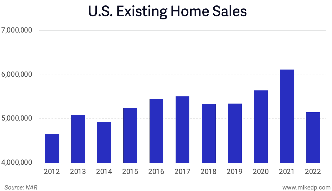
There was enough initial data to reveal an interesting story. Now I entered a phase of rapid iteration and exploration (more data, more visualizations, more insights). I collected ten years of historical data, back to 2012, and started plotting everything. It turns out that 2022 wasn’t a disaster after all and the monthly volumes fell within the bounds of several past years.

I also made my own estimates for the rest of the year. At the time, 2022 was running around 10 percent lower each month compared to 2019. What if volumes were down 10 percent for each remaining month? It’s rough, but it’s a start, and the result provided a relatively solid estimate on what the remainder of the year could look like.
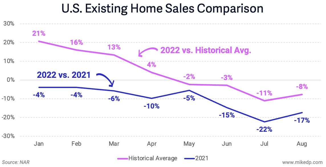
Meanwhile, at this point I started rolling over various narratives in my head. The first was something along the lines of, “2022 isn’t as bad as it seems.” Yes, the market is slowing down compared to last year, but put within a wider historical context, the market is still active, people are still moving, and, most revealing, transaction volumes are within the bounds of historical averages.
It was around this time that I stumbled upon the answer to my question, “What else should I know about this situation?” The answer was the commission pool, and the insight produced a powerful one-two punch for the entire analysis. Not only was 2022 not as bad as the headlines suggest, but because of rising home prices, the commission pool was going to remain at near-record levels — far above the historical average.

The commission insight revealed itself thanks to my previous work. I had written about how big tech companies were coming after agent commissions in the past, so it’s a topic that occupies a permanent place in my mind. It simply appeared, like many insights do, during one of my mindless moments riding a bike, sipping coffee, driving across town, or hiking in the mountains.
For this article I also created a rough outline. My intention with an outline is to collect and order the various key insights and takeaways as I discover them.

Step 4: Data Visualizations
At this point I was committed to writing and publishing something. The bedrock of my analyses are clear, concise, and compelling charts — the creation of which is a non-trivial task!
It’s at this point I go back to my narrative; if the point is to show that 2022 isn’t so bad in the context of past years, how can I quickly demonstrate that with a clear chart? I started with a line graph showing monthly sales volumes.
The chart wasn’t compelling because the key takeaway wasn’t immediately clear. Back to the drawing board. Only after several iterations did I realize I didn’t need to show monthly volumes; annual would suffice to tell the story. Simplifying the chart helped to sharpen the narrative.

Adjusting a chart’s y-axis is a subtle way to influence how data is visualized and interpreted. It’s a mechanism that I typically steer away from (I’m generally a y-axis starts at zero purist), but in this case, I felt that adjusting the y-axis helped to tell the story in a clear and transparent way.
Step 5: Writing
Sitting down and writing a first draft may be the fastest part of my entire process. By this point, the story feels seventy-five percent clear in my mind. I start by putting all of the graphs I’ve created into one document and order them in a way that tells a clear story. Visuals first, then words.
My writing aims to weave the various data together into a clear and compelling narrative. I always start by describing the key takeaways for each graph.
For me, the most challenging part of writing is the introduction. Robert Caro, one of my favorite authors, distills down an entire book into 1–3 paragraphs before he starts writing. That’s what I endeavor to do; how can I summarize the entire analysis into one sentence? And next, why should someone care?
The writing went pretty quick for this analysis, and my subconscious chipped in with an assist. Over the weekend, the introduction simply materialized in my mind while hiking. I’m grateful for the parts of my brain that continue to tick away on something while I’m otherwise occupied.
Step 6: Editing
Just because I write something doesn’t mean it’s immediately worthy of your time. The entire piece, from data to charts to words, needs to be continually refined until it’s distilled down to its purest form. This process is agonizing and immensely enjoyable all at once, and usually lasts a few days. For this 361-word article, I read, re-read, and revised the draft at least fifty times.
Phrases like “less is more” and “quality over quantity” are often part of my everyday life. My editing goal is the same: to provide the smallest amount of information necessary to make a strong point. In this case, many extraneous sentences (and even a chart) were removed in order to provide a clear and cohesive narrative.
Every single word needs to add something to the analysis. If it doesn’t, I cut. And editing isn’t limited to words; it also includes charts. Adjusting chart titles and adding call-outs are just as important.
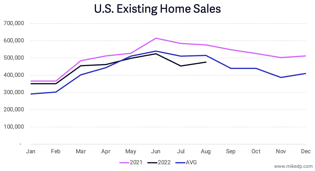
The following chart benefited greatly from the addition of several key percentages, explanatory text, and a visual representation of the historical average.

This chart also benefited from a pair of call-outs to reduce the mental load for the reader.
I also realized the commission pool chart would benefit from a clear visual of the additional $25 billion compared to 2019.

While editing, I send multiple draft emails to myself for the full mobile reading experience. It's important to read my drafts as my audience will, and the process helps with editing, readability, and overall flow. For this article, I sent three separate draft emails to myself.
During the editing process I occasionally nerd out a bit. I love grammar and punctuation. There’s an important difference between an en dash and a hyphen. And for this article, the Gregg Reference Manual helped me by providing guidance on how numbers should be written out in sentences. I write out “percent” instead of % on purpose. Three of my favorite books are within arms reach on my desk.

One of the final pieces of editing is getting the heading and subject line right. I don’t write headlines as clickbait — I aim for a brief, compelling summary of the content of my article. In this case, there was much agonizing over individual words: is it “2021 Is The Outlier,” or “2021 is An Outlier?” Details matter.
An important component of my editing process is time. I often do a few editing passes in a row, but then need to let it sit for a few hours while I do something else. There’s no point, at least for me, to power through the process. Once I hit a wall, I need to leave it and come back to it later, which never fails to produce a better outcome with a somewhat refreshed perspective.
Just Press Send
I could continue editing for weeks, but at some point the entire process comes to a close with diminishing returns (and my need to mentally move on to something else). I’m always thrilled to publish a new piece of work and to see the reactions. I enjoy the responses I receive from readers, oftentimes sharing their own perspectives and observations on what I’ve written about.
I enjoy writing. At times, the process can be laborious and mentally taxing, but I’m passionate about the topics I write about. My fulfillment comes from the journey, not the destination. In the end it’s the entire process — from initial curiosity to final edits — that makes me, and hopefully you, a little bit smarter.